Good Newspaper/Magazine Layout

Newspaper layout choice that I appreciate in terms of good visual design.
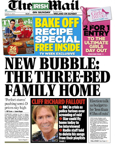
Why I chose this piece is down to the simplicity of the layout. It's three column text grid without all the clutter of a tabloid.
There is the title, clear and draws you in, not too big or small, a short brief about the article followed by the article and an image the article is based on. Short and sweet without the bombarding of news and confusion,
The font is consistent throughout the page which means less chaos for reading for me. and I don't have to worry or feel anxious about it either because its a broadsheet and is calming in regards to layout .
 |
| Image Source |
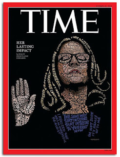
Now this, for me, is truly awesome. I love that there is a lot going on but yet nothing at the same time. It is Simple and unique that we haven't seen a thousand times every day like other magazines which are flooded with tips, advice, news and images.
The font is, you guessed it, Times, and the brief and title is very short. The best part of it all is the image. Created using text in many different styles to shape out a person and in different colours to match skin tone and clothing. It is so small a thing yet so powerful and I appreciate that. It lures the eye in and makes me want to read it. there is mystery to it because its not overloading with information, which in turn, beats all other papers and magazines.
Comments
Post a Comment